


Today’s topic comes from the quirky experiences that arise in print production. When dealing with any visuals like graphic art, there is quite a bit of time spent on the proofing process since color is rather subjective. All of our eyes function differently and perceive hues slightly different.
This is of course much more noticeable and extreme with someone who has “color blindness” and sees muted hues or cannot differentiate particular color groups from one another.
Warning..SCIENCE ahead!
Its a strange thing our eyes do when we see colors side by side. Some colors are naturally complimentary to one another; signified by their appearance on the color wheel.
We all have a subjective appeal when looking at different colors, and all colors appear slightly different to each eye. It’s no wonder why agreeing on what we see isn’t always easy.
Let’s do an exercise – these colors happen to represent the brand colors a client wanted to use for their tension fabric backwall and podium.
Which color boxes look lighter and which look darker? I think the boxes on black look more rich and vibrant, popping off the screen. The boxes over white look lighter, more flat and washed out. I would think the opposite to be true, that the comparable color swatch vs the black would make the color look dull by comparison.
What happens is your eye views the color and background as a whole. The contrast of black creates more separation, more definition between the green and orange swatches vs the black. The white on the other hand seems to allow all the colors to appear more muted as a whole.
The slight variation of the colors makes it difficult to tell what the real green and orange shades should look like. The top and bottom sets of boxes are indeed actually the same, exact color.
What does this matter? This issue arose when we printed a fabric color proof for a client not long ago. Originally the sample was printed on the clean white background of our natural Polyester fabric, to illustrate how the green and orange brand colors will look when printed. The client was not thrilled with the outcome and at this point would not approve the proof, even though their exact colors were being used.
We then did a second print proof, this time including the actual black background that their final tension fabric wall would use. The rich black contrast against the green and orange did the trick. The colors now had the vibrant, neon POP that the client expected to see. Nothing had changed other than the background, the accompanying color – in effect: the context.
Let’s look at a more extreme example. Whether we believe it or not, this dog illusion shows our eyes are lying to us. Look at the image below. Any one of us would be absolutely sure that the bottom left dog is more yellow with less blue, and the top right dog is more blue with less yellow, right?
Now that you are good and sure of yourself, know that in truth the dogs are exactly the SAME colors! This seems impossible, but what we think we see is actually a distortion, a mush-mash of color hues that are in contention with one another. The gradients and offset, bold colors are coming together to create a warped appearance of what is really there. I know you don’t believe me, so check out the dogs with no background.
The illusion becomes clear as soon as we see the dogs without the gradient background interfering, “polluting” the image if you will. Its easy to think that we are playing a trick on you, that the two images were actually created differently. Of course, you are welcome to try the exercise in Photoshop or similar for yourself.
It is a strange process how our eyes form visions, and for that matter the way the brain creates memories. Each is a partial, imperfect menagerie of elements your eyes can actually record and then translate into a meaningful image. It is in truth, a work of fiction based largely upon previous experiences. Our mind fills in the blanks and inserts parts it can make sense out of, to explain what it can’t.
Color context is a huge factor in this deception. However, shading and lighting add one of the biggest influences to trick our eyes. Even when colors are not seen in a confusing combination, the perspective and lighting in which we see those colors or patterns is still warping how we perceive them. I will leave you with this mind blowing animation showing another of these popular illusions in action.
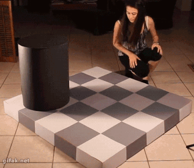 Image Source: Gifak.net
Pretty cool, right? Before our eyes, what we think we see is not as it is. There are many factors in our world that change our perception. The first step in having good judgement when reviewing art is to better understand how our mind works. You can then keep this in mind and better compare what you are looking at so everyone can agree and be happy!
Interested in getting graphic design recommendations for branding your next trade show exhibit? We love talking about trade show design and recommending you the best booth solutions for your company’s budget – big or small. Give us a call – the Monster Displays team can be reached at Sales@MonsterDisplays.com or call (888) 484-3344, we’d love to put our experience to work for you.